A hackathon organizer [user] needs a way to allow participants to self-add live sessions to their calendars [need] in order to reduce the stress and time spent on manually sending invites [goal].
A seamless experience to add live sessions
Final prototype
A hackathon participant [user] needs a way to save their project submission progress [need] in order to track their work and avoid losing important updates [goal].
An intuitive flow for saving submission progress
Final prototype
9/10
average promoter score
100%
of users
would use the new features
Earth is an all-in-one platform designed to simplify hackathon management for organizers, participants, and judges. It centralizes everything you need—hosting events, team formation, and streamlined judging—in one easy-to-use tool. Whether your hackathon is virtual or in-person, Earth ensures a smooth and organized experience from start to finish.
Timeline
July 2024
(4 weeks)
Team
1 Product Manager
1 Designer (Me)
3 Developers
Constraint
Short turnaround time
Limited Resources
Context
Earth had finished running 2 corporate hackathons and a bunch of feedback was left from our users. My product manager and I wanted to review the feedback and decide on the next step to take before the next hackathon happen in 1 month.
Goal
To review feedback and improve Earth's experience for the organizers and participants within a month's timeline.
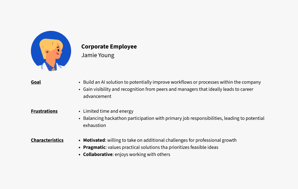
Earth didn't have preexisting personas. I felt that I could better design if I put myself in the shoes of Earth users, so I built 2 primary persona to think about how they would interact with Earth.
Gather & Categorize Feedback
We collected over 440 responses from post-hackathon surveys, including feedback from participants, organizers, and mentors. I categorized the qualitative feedback by feature to pinpoint areas needing the most improvement and identify features that users were most satisfied with.

Only 39% of participants would recommend Earth to a friend or a future hackathon
My product manager and I ranked each feature improvement using the RICE method to evaluate where our resources should be allocated.
As they are issues that impact both the organizers and participants.
01
Project Submission Form
Participants — can't save their progress causing immense stress in final hours
Organizers — don't have enough resources to provide technical support in final hours
02
Adding Live Sessions
Participants — want to join live sessions on Earth is frustrated when they are redirected to their email
Organizers — an estimated 25 hours were spent on sending invites and attendance is low
03
Team Formation
Participants — have a hard time finding team members with similar interests
Organizers — Misaligned teams result in low-quality submissions
How might we design a smoother project submission process for participants?
One way to improve their experience is through adding the ability to save their submission progress.
To promptly save and submit the submission
To be able to view their submission history and confirmation of submissions
Presentation of Submission Status
End-of-form button
Compact and minimalist: with button and historical submission
Intuitive: placed where users can expect to submit their project
Delayed communication: of save progress functionality
Visually impactful
Clear and intuitive: with familiar colour conventions
Limited visual progression: progression is not communicated
How might we streamline the experience of adding live sessions?
The current experience of joining live sessions is problematic:
Inefficient management
No functionality for participants to pre-save sessions onto their calendars
Manually sending out invites is highly time-consuming and labour-intensive for organizers
Cognitive overload
For participants, it is hard to stay actively engaged on Earth since the primary action to join live sessions is taken outside of Earth
Inability to scale
Any additional sessions would require a massive undertaking
Presentation of 'add live session'
Single-meeting add
User control: add sessions that interest them without cluttering their calendar
Quick build: from a developer’s standpoint
Time-consuming: if participant wants to join multiple sessions
Fragmented calendar experience: no batch approach which makes it harder to keep track what is already added
Multi-select add
Efficient for multiple adds: saving time and reducing repetitive actions
Greater control over meeting selection: offering a balance between control and convenience
Requires additional steps: which could deter some participants
Highly convenient: removes the need for manual selection, saving time
Automatic updates: meeting updates and new meetings are always up-to-date
Lack of control: potentially cluttering their calendar with meetings they aren’t interested in
Commitment concerns: participants may be unsure about the frequency or relevance of all the meetings, which could reduce engagement
'Multi-Select Add' was agreed upon as the ideal solution. However, the developer team's reduced availability and time constraints made us reconsider and move forward with 'Single-Meeting Add' as the most appropriate solution.
How might we get participants to form more efficient teams?
Participants found it difficult to work with team members in different time zones and misaligned areas of interests.
Insights
58%
of participants
looked up people they wanted to work with
40%
of participants
worked with people they know
Things that participants want to know:
Skill level
Areas of interest
Personality
Past hackathon/work experience
Profile Completion
Taking the best of both worlds
Using the "sign up and write up" concept as the base, I brought in elements of the "to-do list" that made it more engaging.
Made questions optional and a button for the user to complete later
Reminder on the dashboard is more prevalent
Additionally, a team member suggestion section is added to the dashboard.
Presentation of 'member suggestion'
Familiar to user
Saving vertical space: keeping the main page more compact and focused.
Limited visibility of items
Mobile experience: will likely need customized components
Grid
Recycling existing components
Better for comparison: based on experience, skill level, area of interest
Not visually distinct
Due to budget and time constraints, we decided to prioritize the organizer’s experience, and omitted the 'profile completion' and 'member suggestion' features. I tweaked the case study for the prioritized features.
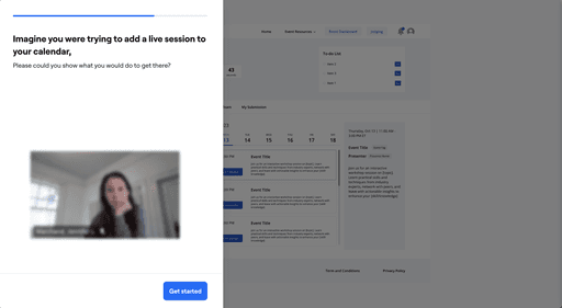
I settled on a think-aloud & probing approach for its speed and cost-effectiveness. We tested our new add live session flow and submission banners on a focus group of 5 users through a guided prototype I built in Maze.
I defined 2 questions to centre our usability testing around:
How well does the participant understand our join live session flow?
How intuitive are the submission status banners?
Testing was a success! Some key feedback pieces we noted for our next iteration were related to automation — ideally the user would like to see auto-save as the default for saving progress.
9/10
average promoter score
100%
of users
would use the new features
Solution
Small, iterative improvements were made rather than sweeping changes.
Reflection

You can’t always ship a "perfect" product…
I would have liked to have done my testing, iterations and spent more time on design, but, shipping the feature is prioritized for this project. We can always make more iterations in future updates ;)

Your design for 1 end user influences the experience of another
I had to put myself in the perspective of multiple end users to gain a comprehensive view of my design. Sometimes, what would be great for the participants may create more friction for the organizers. Vice versa. It’s the sweetest when my design strikes that perfect balance!

Sometimes, the small features make a big difference
We received requests for many small features/improvements to be made on Earth. While these features independently may only improve the experience of a small portion of participants, the small things add up and help create an overall better experience for all users.

Design problems can sometimes be very specific
Given the encompassing user feedback for this product, I had very specific user problems with very specific solutions. Even so, I approached the problems with an open mind and validated assumptions to ensure the right problem was solved with the right solution.


