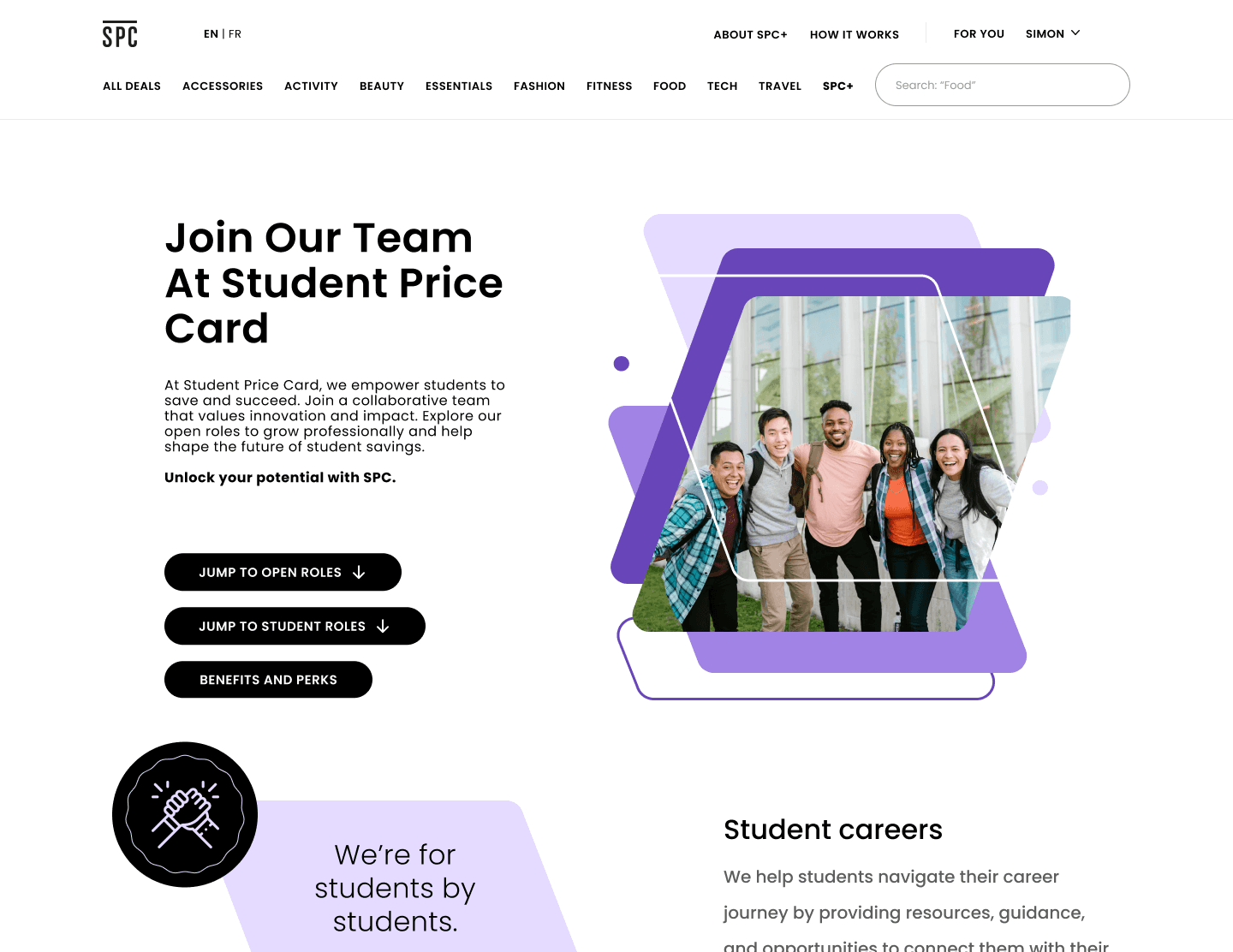
An SPC hiring manager [user] needs the careers page to clearly communicate SPC’s values and benefits [need] in order to increase the quality of applicant submissions [goal].
A well-structured interface that delivers a smooth information discovery journey on the careers and about us pages.
Final prototype
Streamlined Communication
Clarified SPC’s mission, values, and career growth opportunities, reducing confusion among candidates
Strategic Alignment with Company Branding
Set the groundwork for a long-term digital presence strategy by aligning the page with future branding and recruitment goals
SPC is a student loyalty discount program in Canada that offers discounts and deals on items such as fashion, food, shoes, travel, and more. During my time there as a design intern, I owned the revamp of the company careers page.
Timeline
April - September 2023
(16 weeks)
Team
1 Product Designer (Me)
2 UX Researchers
1 Developer
Constraint
Limited development resources
What's the Problem?
SPC’s Careers page is outdated — falling behind newer, user-driven competitors like Student Beans and UniDays. SPC struggles with recruiting high-quality job candidates due to the confusing and poor UI, leading to low talent attraction and financial losses.
Goal
To revamp the Careers page to streamline talent hiring process, and showcase SPC’s fun work culture.
Key User Action
To apply to job openings
How might we…
Redesign a compelling, user-centred Careers page to attracts top talent?
I wanted to understand what SPC is lacking and what other companies in the industry are doing right. So I started off by doing a ux audit.
Competitor’s Analysis
I expanded my research beyond direct competitor sites to gain a broader perspective on industry best practices and to benchmark against leading talent attractors.
Takeaways
Colourful, 3D elements attracting attention
High usage of people imagery
First-person, relatable tone of voice
Takeaways
Quick links are accessible on hero section
A quick overview of all the company benefits and perks
Highlight industry-specific successes & testimonials
Deliver valuable insights on their industry to build trust
Primary Reserach
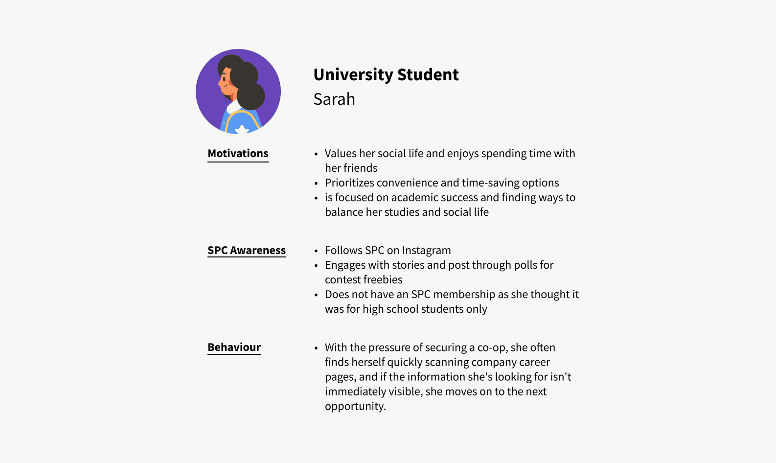
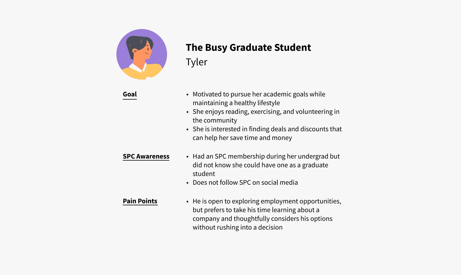
A survey to 20 current job seekers told me their current frustrations and what they value:
Insights
67%
of users
rated "information on job openings" as the most important when visiting the Careers page
"employee testimonials" ( 60%)
"company overview"(47%)
15%
users
said that they like to find out about “the people who I will work with and the culture.”
25%
users
found “Not knowing how long companies take to respond” frustrating.
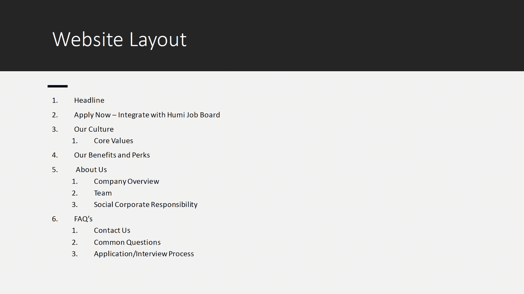
A narrative structure is integral to telling a good brand story. The product owner provided a very specific narrative structure for the new webpage, but based on my research and UX best practices, I thought some adjustments could be made.
Narrative structure provided by product owner
I stuck to the conventions apparent on most careers pages. With students in mind though, I saw two main approaches for presenting our brand story and careers information.
Familiarity: by splitting information into 2 pages
Quicker access: to job-related information
Reduce cognitive load: by removing nesting categories
Lower scannability: long page scroll
One-stop shop: for all company and job information
Optimized for info priority (based on survey)
'About Us' button not effectively used
Lower scannability: long page scroll
We decided on the Content Split approach because it maximizes the value of a careers page: a goal-driven approach to presenting information on a page that is digestible for the applicants.
flat colours
Sharp, clean lines and shapes
Professioal tone of voice
Colourful
Youthful and fun text and image treatments
Relatable tone of voice
Brand - portrait imagery leans into being people-focused
Simplicity - photo grid is easy to implement and resize
Brand - missing the fun element of the brand
Brand - team imagery invokes friendliness and warmth
Brand - rounded button are approachable
Brand - parallelogram isn’t a part of the current brand
Robustness - decorative icon doesn’t reposition well for mobile
Brand - Rounded button are approachable
Brand - Lack of people imagery doesn’t create a sense of community
Robustness - Decorative elements don’t reposition well for mobile
We decided to move forward with a “clean illustrative” approach — the best of both worlds.
Presentation of 'open positions'
Imagery
Friendly, approachable imagery
Not robust: difficult to translate to mobile responsively requires significant effort for each item
Cards
Easy to scale
Easy to manage collection lists
Ability to filter teams
No spotlight of culture & community
Presentation of 'testimonials'
People-forward
Expansive imagery is welcoming and authentic
Visually intersting
Images likely won't scale well without custom tweaking
Testimonial-forward
Recycles similar layout in 'Company Value' components
Not scannable: difficult to digest all the text at one glance
Missing the relatable, friendly look and feel of the brand
tone down on micro-animations
Keep breakpoint optimization in mind on design
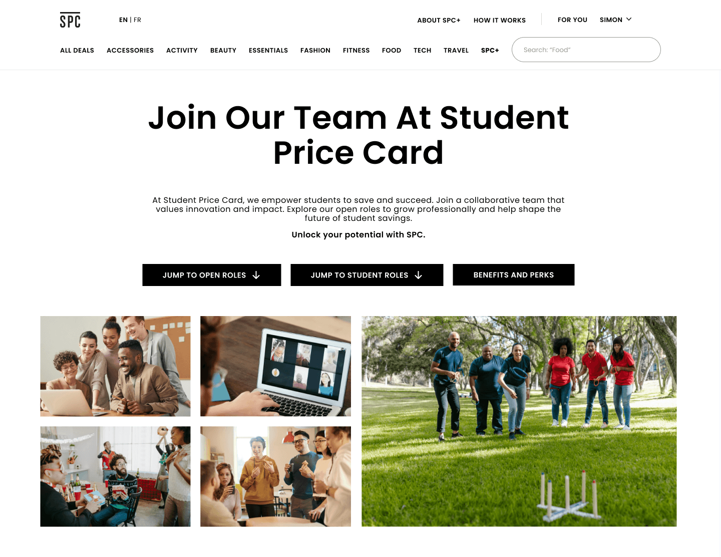
Before & After
Hero Section
'Our Story' Section
'The Squad' Section
'Benefits & Perks' Section
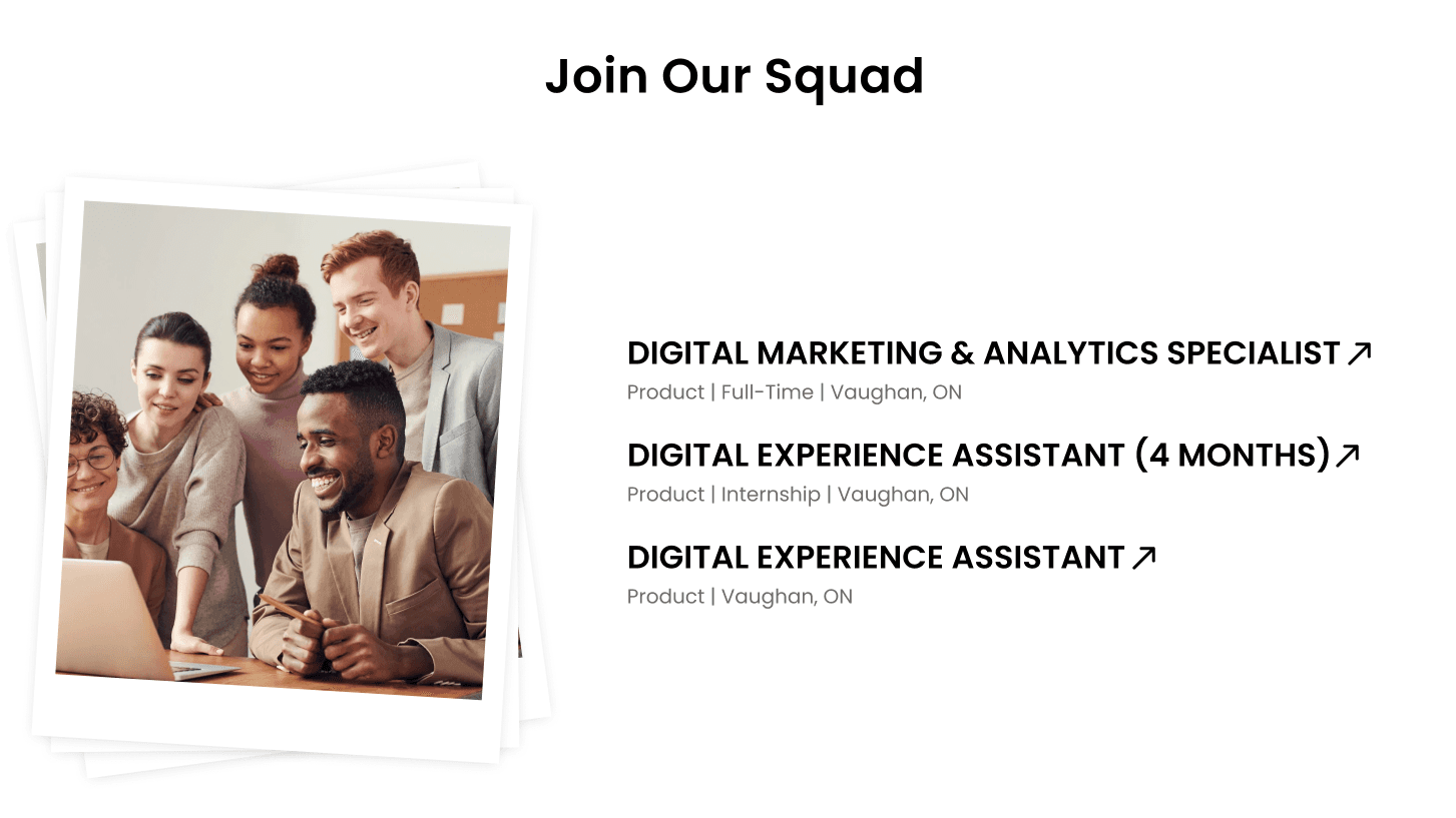
'Join Our Squad' Section
Reflection

Validate Top-Down Requests (if possible)
Even if you’re handed really specific instructions from the top, it’s worth taking a second to validate them. You might end up spotting some unexpected opportunities or ways to make things even better than planned.

Present Options Wisely
It’s great to give people a few options to choose from, but try not to overdo it. Too many choices can lead to decision fatigue and end up stretching the project timeline longer than needed.

