Mobile Design / Rapid Prototyping /
Reducing food waste made fun for students
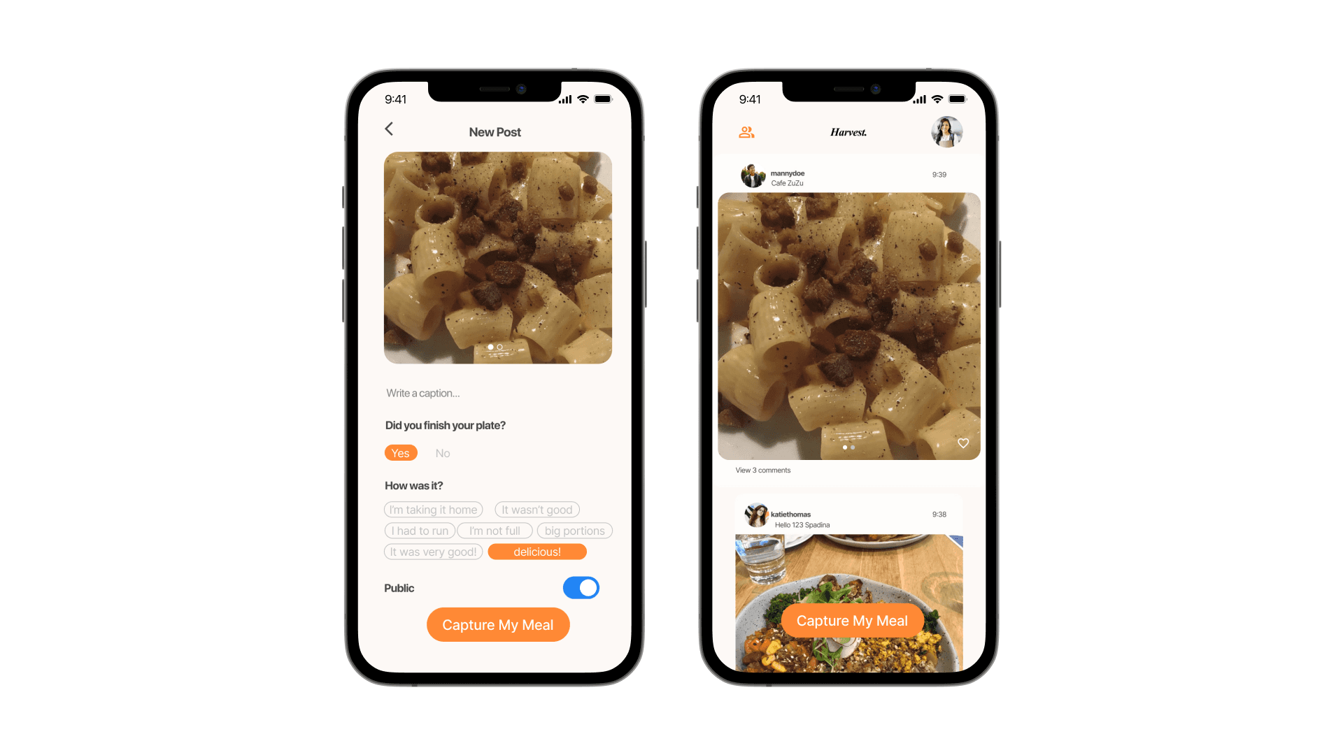
Harvest — a social media app for your meals

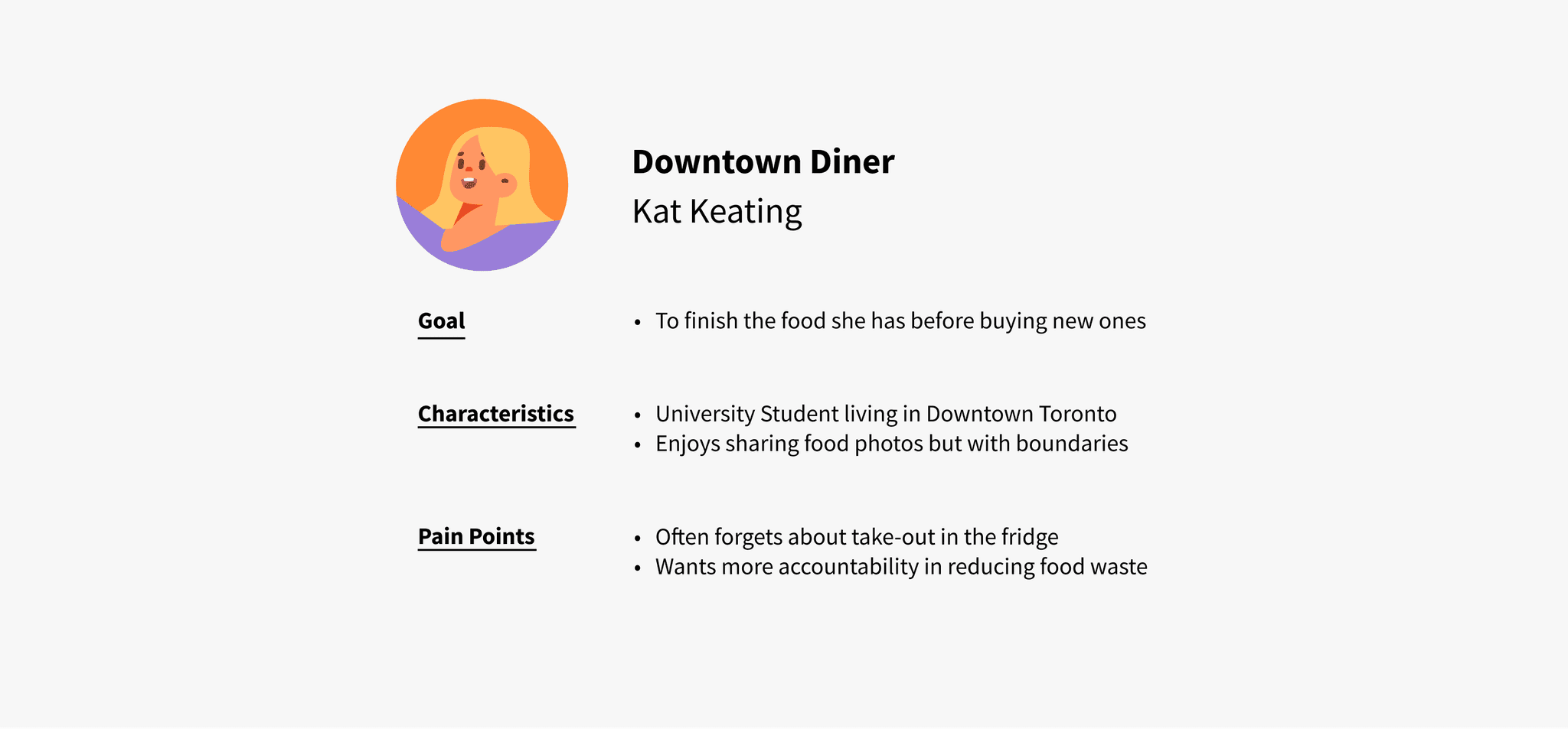
A university student [user] needs external accountability to better track their food consumption habits [need] in order to minimize food waste from unfinished plates [goal].
A sustainable, habit-forming app that empowers university students to reduce food waste over time.
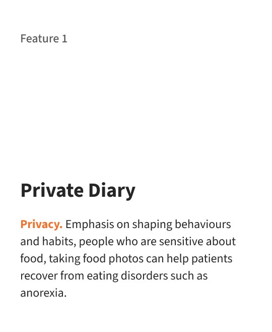
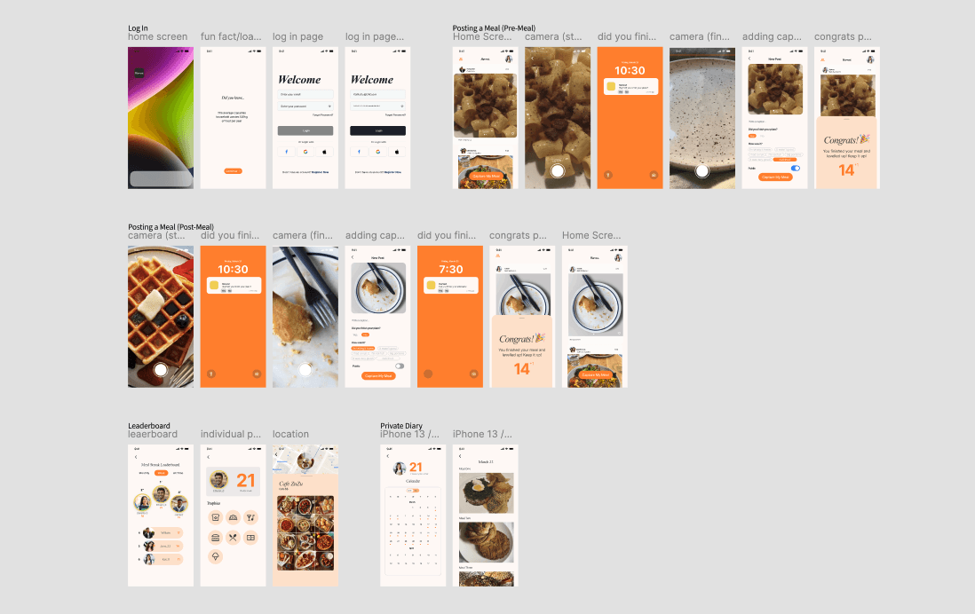
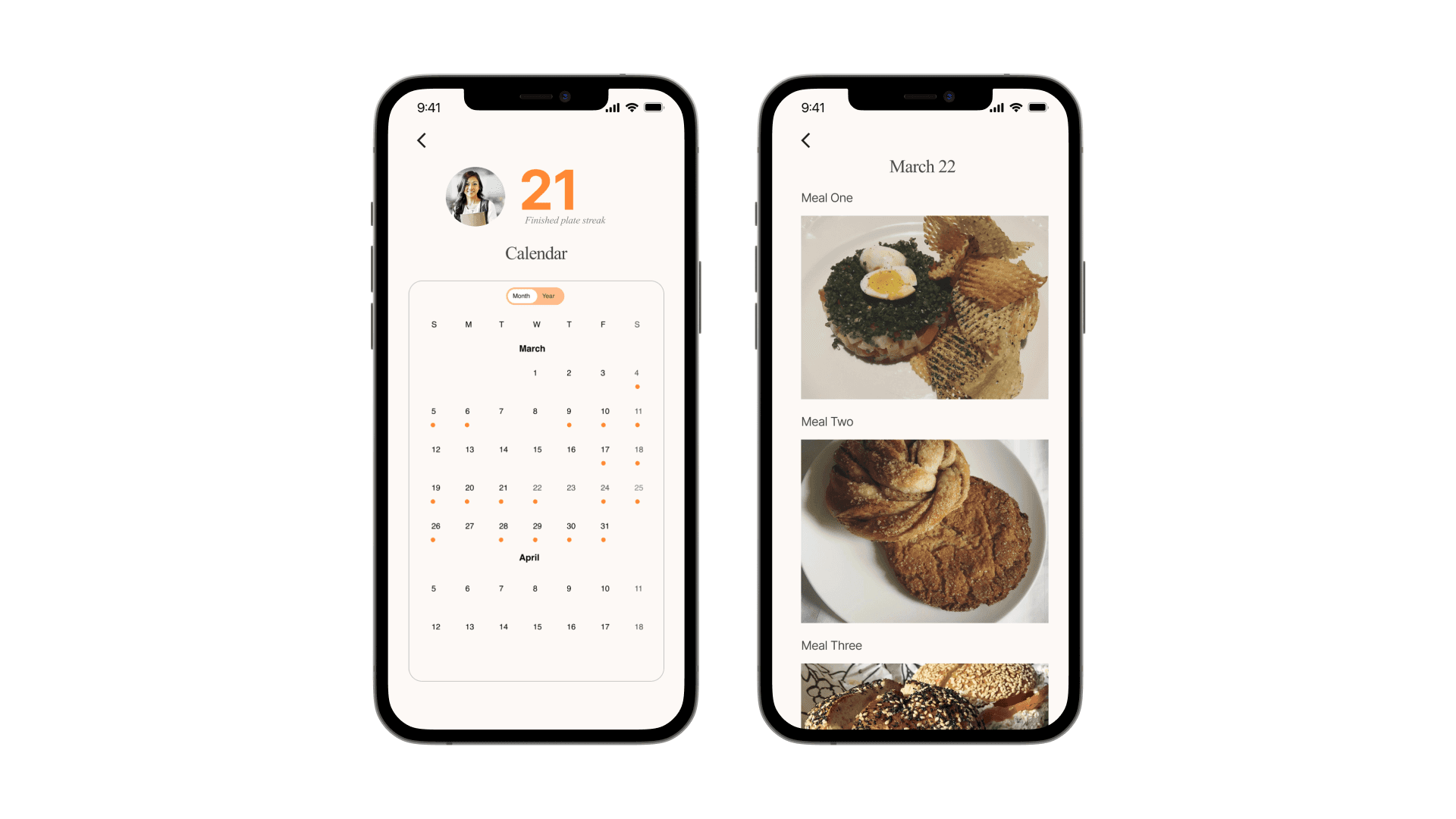
Private Food Diary Flow
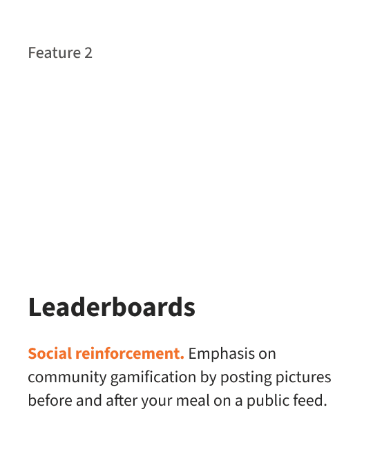
Leaderboard Flow
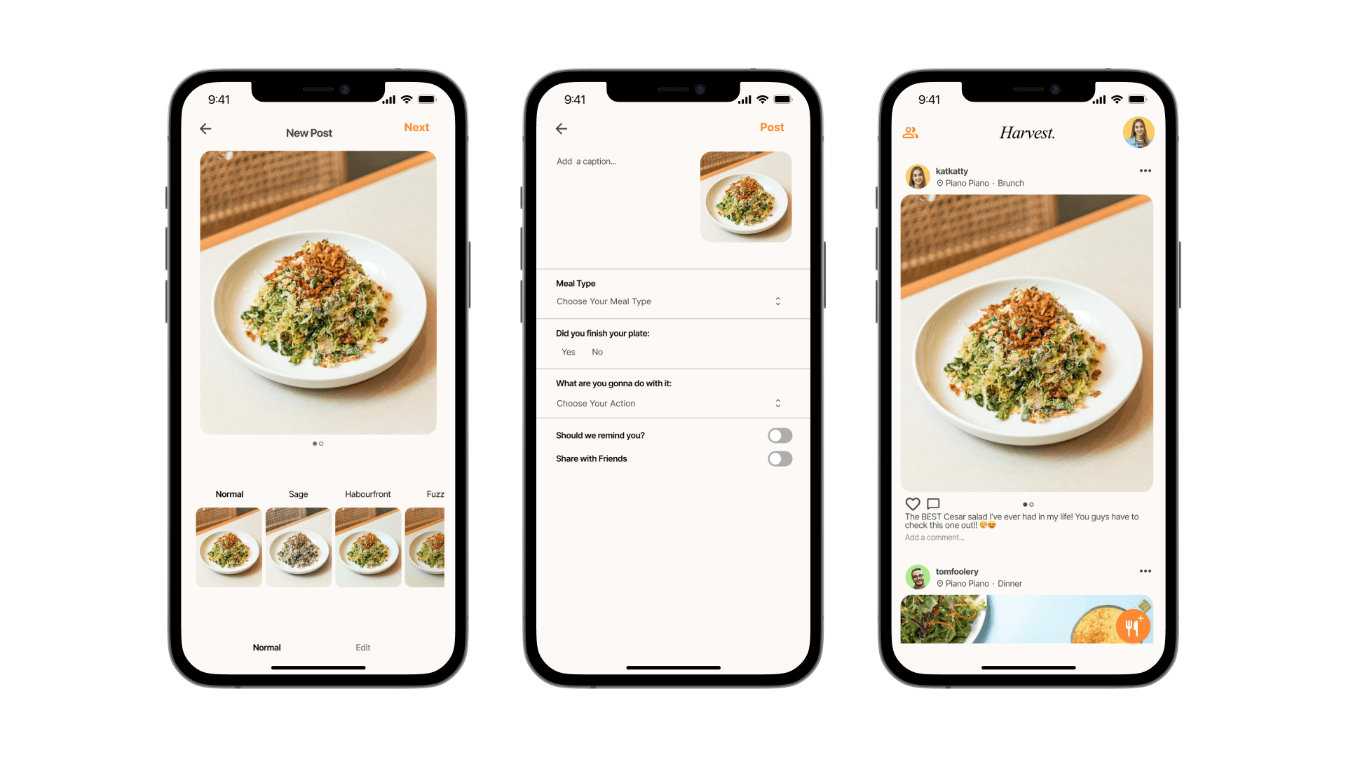
Posting a Meal Flow
Empowered Behavioural Change
Helped students establish new, sustainable habits by providing gentle reminders and motivating feedback throughout the app experience
Elevated Awareness of Food Waste
Shifted the mindset of students toward more conscious consumption and waste reduction, fostering a culture of sustainability
Context
Timeline
April 2023
(5 Hours)
Team
2 Designers (Me)
2 Business Strategists
Constraint
Starting from scratch
Short turnaround time
Impact
1st Place
winner of the UW/UX Designathon
Challenge
How can we use technology to make the world a better place via gamification?
Identifying Our Problem Space
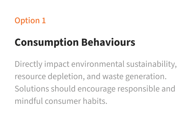
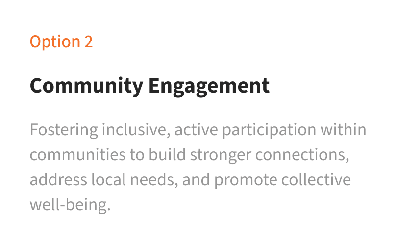
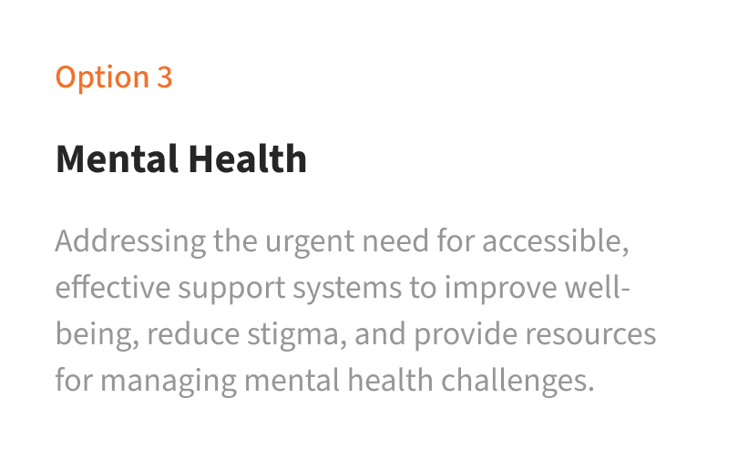
We wanted a solution that was well-focused and impactful, so our team conducted a lightning brainstorming session to identity our potential problem spaces we could explore.
We wanted to evaluate which problem was the most fitting for our team to pursue, so we evaluated each option by 3 factors.
Ultimately, We decided to go with food waste from over-consumption.
How might we…
Create external accountability for university students to help them recognize and improve their food consumption habits, reducing the impact of unfinished plates on overall food waste?
We wanted to validate our problem and understand our target users’ current pain points, so we conducted both secondary research and user interviews.

The average size of a single restaurant meal has increased by 69% for main dishes and 27% for desserts over this period.
Source: University of Toronto

#foodporn has 296M posts on the #1 photo-sharing app, Instagram.
Source: The Millions

58% of all the food produced across the country is wasted.
Source: Global and Mail

Almost 2.3 million tonnes of edible food is wasted each year - costing Canadians in excess of $21 billion.
Source: City of Toronto
Phone interviews to 4 university students told us their frustrations and what they value:
“I like taking photos of my food and sharing them with my friends, but I’m not sure about sharing my finished plates with people”
“If I don’t finish my plate I’m take it home with me but once it’s in the fridge, I just forget about it.”
Most individuals (69%) feel it's their responsibility to minimize food waste, though they could benefit from a bit of support.
Based on both of our primary and secondary research, we deemed that there was a valid problem at hand.
We targeted 3 main pain points our target users expressed and conducted a solution brainstorming session. For our MVP, we decided to include 3 key features to show as a proof-of-concept.
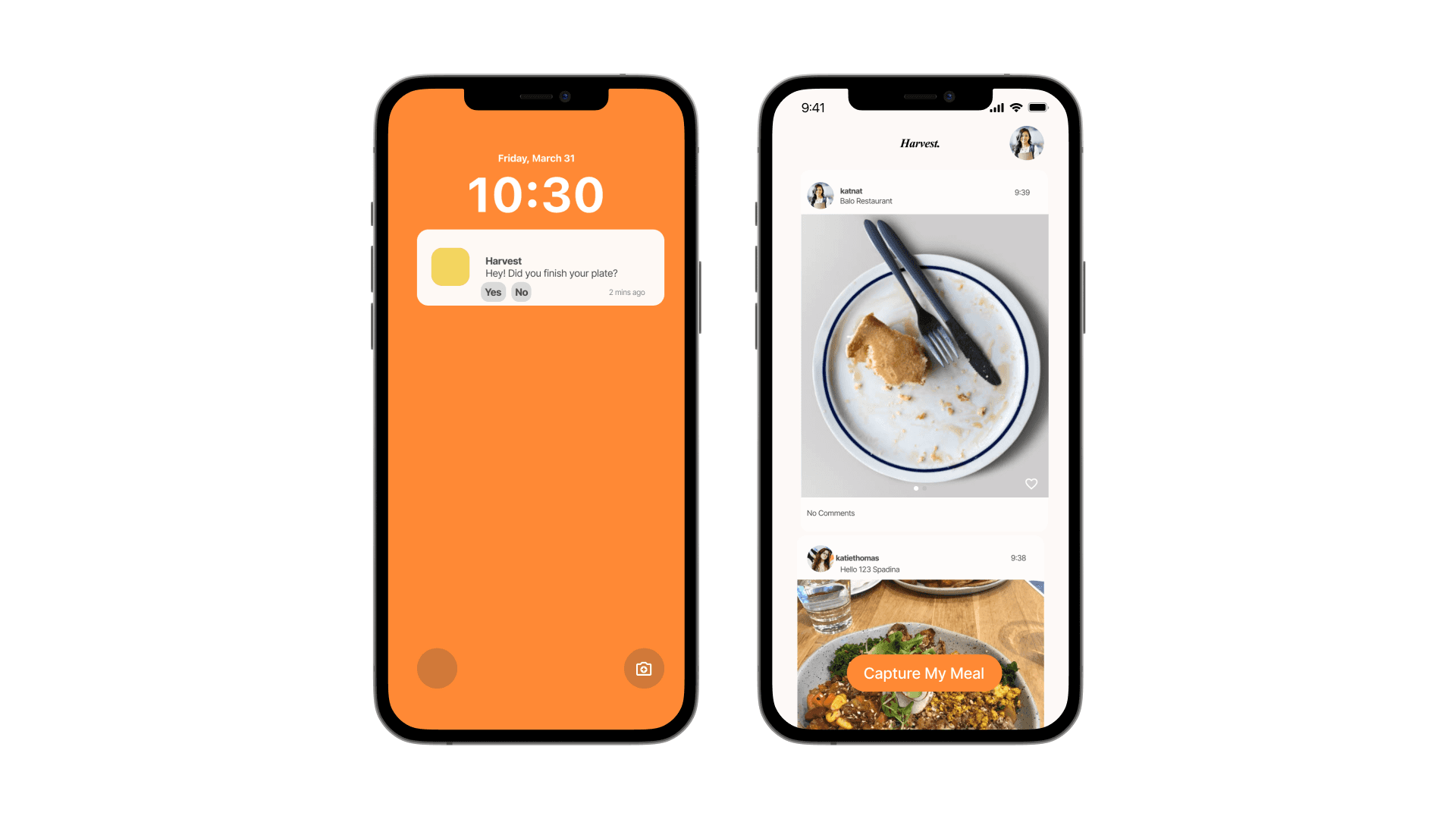
From a rough user flow and lo-fi wireframes, we transformed our idea into a working MVP.
We presented these screens (in a working prototype) to a panel of judges after the end of the designathon.
Given the short turnaround ime, our team did not get to flush out all of our ideas in our MVP, so our team revisited this product after the designathon to polish our user flow, design, and interactions.
Presentation of 'posting a meal'
MVP
Iterated
Functionality: ability to edit photo
Hierarchy: prioritizing content over photo preview
Consistency: home feed padding
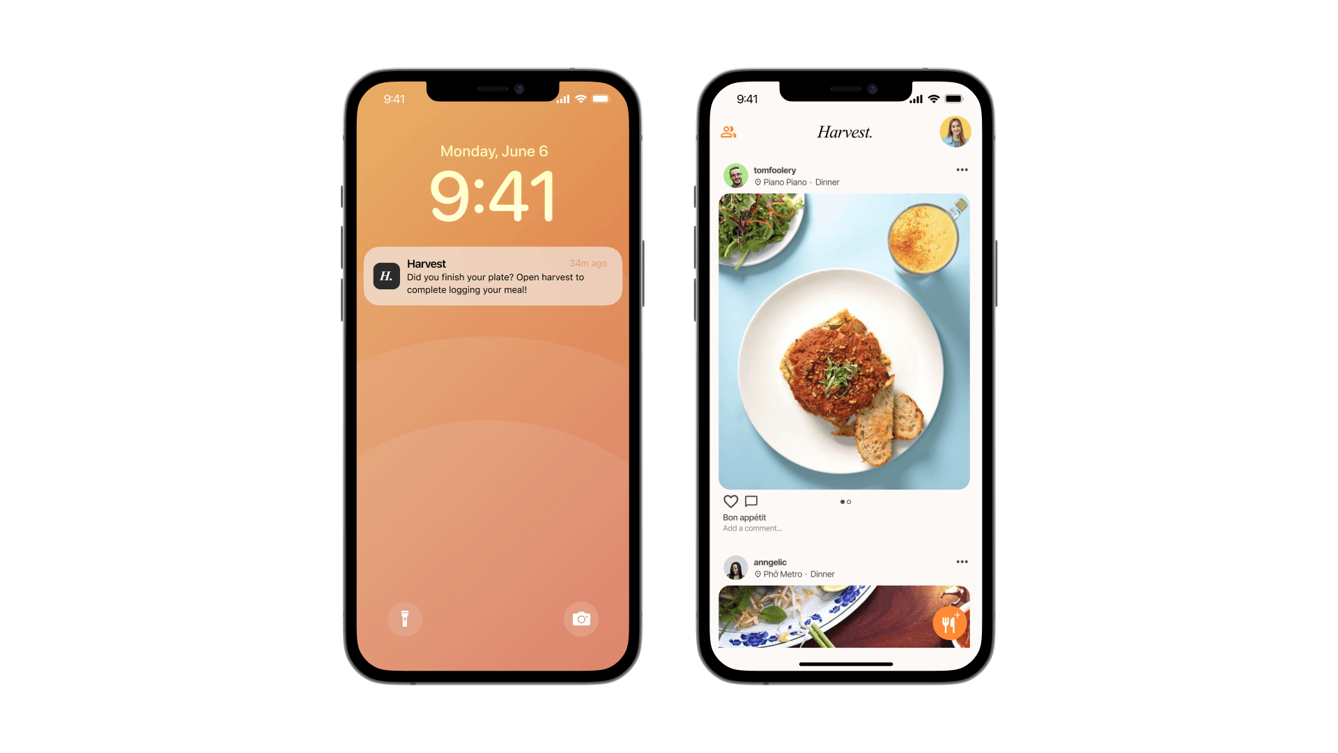
Presentation of ' homepage'
MVP
Iterated
Visual: cleaner, more uniform interface
UX: carousel indicator and ability to like and comment
Presentation of ' private diary'
MVP
Iterated
Consistency: card header, round corners, and layout
UX: ability to filter calendar by month and year
Contrast: white background against black text to improve readability
Takeaway

Don’t hold cack, over-communicate
This is the first time I, and everyone on my team, has worked with such a short turnaround time, and we turned that anxiety into constant verbal communication, and that was the #1 thing that helped us be efficient. We kept everyone involved in the brainstorming process for as long as possible until we were all aligned, and then we splited up to work on the presentation and prototype separately.

Tell a story
Focusing on telling a story and inserting anecdotes where necessary made our idea easy to follow and kept the judges engaged throughout our presentation. This is crucial as the greatest idea wouldn’t be great if it left the crowd confused.
